Wednesday, 13 March 2013

Mother's Day Card

I know this is a bit late but here's a photo of my Mother's Day Card. 

It is a triple easel made with a Hunkydory set (on a Centura pearl base) as you can see from this picture:


The main panel is held back with a Craftwork cards sentiment and a lovely sparkly butterfly. Added a few sparkly gems to bling it up :-)


I've heard it has had quite a few compliments so that is nice!

Short and sweet post tonight.  I'll do a longer one next time.

Helen x


Tuesday, 12 March 2013

Birdcages, bows and roses

I love the trend of vintage birdcages (even though caged birds make me sad) so when craftwork cards brought out some pretty little birdcage diecuts I had to indulge...  And this is what I came up with when the creative juices were in full swing:


I think this is one of the prettiest little cards I've made (not even going to try to be humble as I love it!).  I inked the birdcage with a flexmarker, shaped it so it was domed, and added some gorgeous little paper flowers, some punched leaves, and of course the obligatory ribbon. You can see how it is domed a bit better here:


This time the ribbon is seam binding that had been dyed subtle greens and pinks with distress inks.  I'm loving adding buttons at the moment, and if you are short on supplies HobbyCraft do a massive bag of odd buttons in their value range. The top patterned paper is Laura Ashley and the base hunkydory.


There is a bit of gorgeous washi tape behind the cage that you can just about see peeking through.

This was another card that was reluctantly given away but I know my friend would love it as she really appreciates all things pretty and handcrafted.  I need to get making some male cards as there has been an overabundance of twee on this blog for some time :-).  Hope you don't mind.

Helen x

Wednesday, 6 March 2013

More Everyday Cards

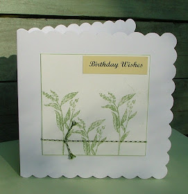
My crafting bug has been running on overdrive recently.  Like the previous post I've been trying to use up some prepared toppers.  Here are a few of the cards I have scrambled together. Always useful for the emergency box when I forget a birthday or need a 'thinking of you' kind of card!


Notice any recurring themes?  Green and pink perhaps, and always a bit nature inspired? At least it looks like I'm developing a signature style! Like Karen's blog is called Stamping in Pink maybe I should have been 'nature crafting with green and pink' - not that catchy though... Keep on the lookout for some crochet creations that might be appearing here soon as well. Yes there is another new craft creeping into my obsessions :-)


Let me know which card you like best if you have a moment. Love the comments!

Helen x


Sunday, 3 March 2013

Spotlight on Colouring with Promarkers and Flexmarkers

I've recently come across a few coloured images I've done from time to time but never made into cards. It was about time they were used so here you go.  I've especially chosen images created with Promarkers and Flexmarkers to share. I've still a long way to go and some of the pictures aren't brilliant but they were perfect for some everyday cards. Here the cards:


 And some close ups to spotlight some of the shading, skin tones, and shadowing:


A couple of people have asked for some hints on colouring with these alcohol pens so I've posted below some of my lessons learnt. Believe me I'm no expert and still learning but I was really appreciative of the advice and hints and tips I got from other people so thought someone out there might find them useful as well.... I've included links to my favourite tutorials and stores. Ignore all you experts out there :-)


Hints and Tips on Colouring with Alcohol Markers

  • Always use a card that is designed specifically for alcohol markers like the Crafters Companion Neenah Card, or the Craftwork Cards Digital Cardstock
  • Put down more ink than you think. Go over a few times, this gives a more even colour and helps keep the area wet when blending which helps the colours mix more smoothly.
  • Before you start decide where your light source is coming from so you know where your shadows will be. 
  • When choosing what colours to do dresses etc then first of all decide on the design of the whole card. If you have a particular paper you would like to do then choose your pens to match in and bring the whole thing together. I did this here.
  • Always pick 3 coordinating pen colours when colouring larger areas. Lay down the lightest first (remember lots of ink), then use the medium pen to shade around the edges or where you need shade - go about 1/3 in. Go over the whole thing again with the lightest pen to blend in. Then use the darkest colour to put around the edges again but this time barely going into the area at all. Again get the lightest shade and going in tiny circles move the colour into the image.  If the middle of the image gets too dark use the blender pen to take out some of the colour.
  • When colouring very light areas go over the whole image with a blender pen first to wet the card, and then bring in the light shades at the sides. Use the blender like your lightest colour above to bring in the colour gradually. See the elephants here and here for an example of this. 
  • When colouring images that don't have a background (like the gorjuss girls or animal characters), always go around the entire image with a light pen. This helps the image to stand out from the page. Favourite colours to use for this are Flexmarker Blue Grey 1 and Flexmarker Antique White depending on whether it is a 'cool' or 'warm' tone image.  Flexies are particularly good as the brush tip gets right into the intricate bits. 
  • Get some fine tips for the promarkers - I have one or two for each colour group and swap them around. Essential for small or fiddly areas.
  • For hair you might need 5 or 6 colours in one shade to achieve depth and make it look shiny. Fine tips are essential :-)
  •  Favourite Caucasian skin colours for me are: base colour satin or almond. Shade colours dusky pink, march hare, coral. Cheeks Pale blossom, pastel pink, budding rose. For other skin tones I'm not going to repeat what is suggested so expertly here!
  • Use Memento or Adirondack ink when stamping so it doesn't run.
  • All time favourite promarker colour that appears in most of my projects is pear green! (Leave me a comment to tell me your favourite colour if you like)
  • For the best tutorials and videos look at these Letraset Tutorials, Kirsty Wiseman tutorials and try and catch Nikky Hall from Polkadoodles when she is demoing on Create and Craft.
To see examples from my archive blog posts, and how I store them then click on promarkers under labels to the right. Any questions then do ask - what colours did I use, how did I achieve certain effects, and please let me know any of your top tips!

Warning - once you start colouring it is a bit addictive!  But you'll love it...

Helen x